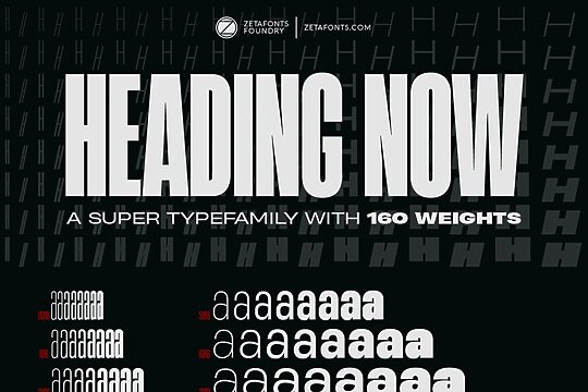
Font
Asgard Wide
Author
Fonts
24
License
Downloads
23
Added
Jan 2, 2022
Description
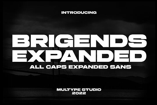
Asgard Wide font family by Zetafonts consists of 24 font styles with a versatile and contemporary sans serif design. It is a free font for personal use constructed in the modern style and inspired by geometric shapes and lines. The typeface is all about little details and minimalistic touches that make all the difference. It captures dynamic forms in each special character to expand your typographic horizons.
Asgard Wide is versatile and suitable for corporate identity projects, advertising, digital publications, and use in UI or UX design. It can be used for website design, packaging, branding, stationery design, social media posts, logos, or physical products such as apparel. Its clean character and legibility are obvious in both print and digital use including strong readability in smaller sizes.
The font family license allows free personal use and any project involving commercial part should meet other licensing terms. In this case, buying a license is suggested as this will also allow the potential addition of web/desktop/app/e-pub.
Author's note
The font here is for PERSONAL/NON-COMMERCIAL USE ONLY!
To download the full font family (all weights, glyphs and numbers) and acquire the commercial license, please visit our website: https://www.zetafonts.com/asgard
For more information about our licenses, visit: https://www.zetafonts.com/licensing
CONTACT US:
Website: https://www.zetafonts.com
Email: info@zetafonts.com
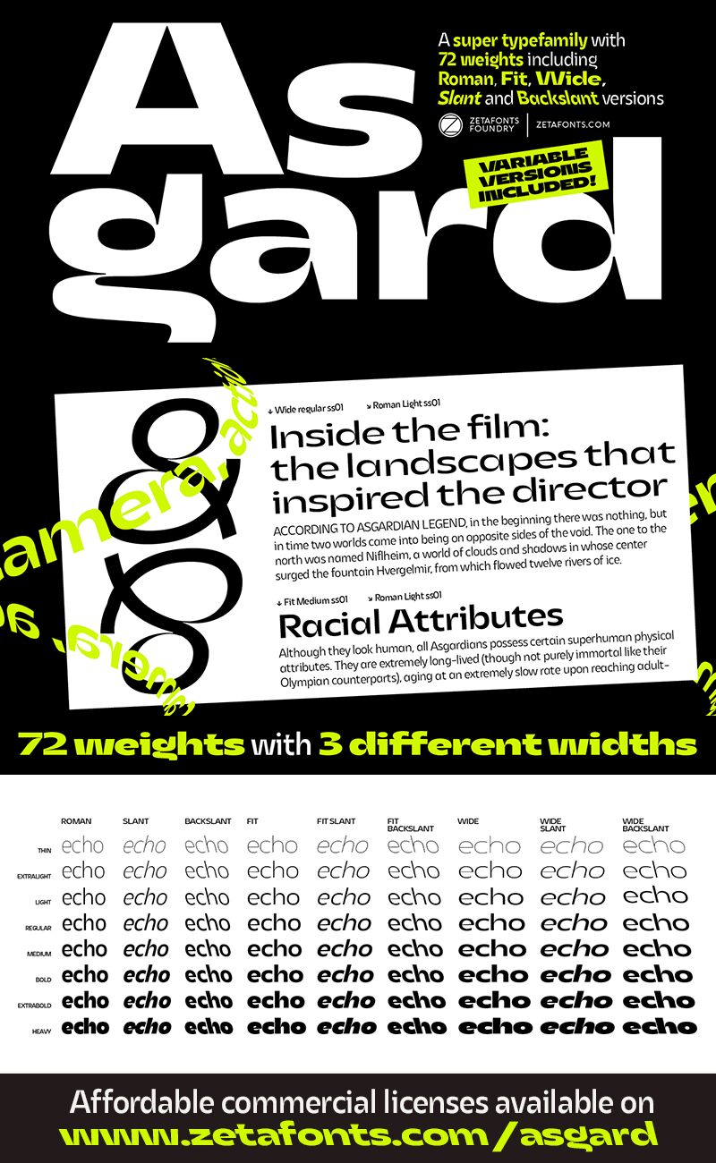
Francesco Canovaro designed Asgard as a way to mix his passion for the raw energy of extra bold sans serif typography with the expressivity of high contrast and calligraphy-inspired letterforms. He built the typeface around a strong geometric sans skeleton to make the letters feel solid and powerful, using wood-type vernacular solutions to solve density through high-contrast details. The typeface name was chosen as an homage to the mythical homeland of the Norse Gods, evoking a land of fierce warriors, power, and strength, as well as divine, delicate beauty.
The original design was extended with the help of Andrea Tartarelli and Mario de Libero, expanding the number of weights and widths to create a "workhorse typeface" approach, and adding a slanted axis to experiment with italics. The result is a super-family of 9 styles in 8 weights, for a total of 72 fonts, each with an extended set of 968 glyphs covering over 200 languages using Latin, Greek, and Cyrillic scripts. The three variation axes (width, weight, slant) are also accessible in a variable font version included with the whole family.
This gives designers a full range of options for typesetting, with the Normal and Fit widths providing basic display and text-sized alternatives, and the Wide width adding more display and titling options. The inclusion of backslant italic styles gives Asgard an extra chance to add its voice to the typographic palette. To complement this, all Asgard fonts have been given a full set of OpenType features, including standard and discretionary ligatures, stylistic sets, positional numerals, and case-sensitive forms.
Dynamic and expressive, Asgard is a super-family that manages to look brutal and refined at the same time, quoting the vernacular typographic practices of letterpress print while expressing the contemporary zeitgeist.
To download the full font family (all weights, glyphs and numbers) and acquire the commercial license, please visit our website: https://www.zetafonts.com/asgard
For more information about our licenses, visit: https://www.zetafonts.com/licensing
CONTACT US:
Website: https://www.zetafonts.com
Email: info@zetafonts.com
Francesco Canovaro designed Asgard as a way to mix his passion for the raw energy of extra bold sans serif typography with the expressivity of high contrast and calligraphy-inspired letterforms. He built the typeface around a strong geometric sans skeleton to make the letters feel solid and powerful, using wood-type vernacular solutions to solve density through high-contrast details. The typeface name was chosen as an homage to the mythical homeland of the Norse Gods, evoking a land of fierce warriors, power, and strength, as well as divine, delicate beauty.
The original design was extended with the help of Andrea Tartarelli and Mario de Libero, expanding the number of weights and widths to create a "workhorse typeface" approach, and adding a slanted axis to experiment with italics. The result is a super-family of 9 styles in 8 weights, for a total of 72 fonts, each with an extended set of 968 glyphs covering over 200 languages using Latin, Greek, and Cyrillic scripts. The three variation axes (width, weight, slant) are also accessible in a variable font version included with the whole family.
This gives designers a full range of options for typesetting, with the Normal and Fit widths providing basic display and text-sized alternatives, and the Wide width adding more display and titling options. The inclusion of backslant italic styles gives Asgard an extra chance to add its voice to the typographic palette. To complement this, all Asgard fonts have been given a full set of OpenType features, including standard and discretionary ligatures, stylistic sets, positional numerals, and case-sensitive forms.
Dynamic and expressive, Asgard is a super-family that manages to look brutal and refined at the same time, quoting the vernacular typographic practices of letterpress print while expressing the contemporary zeitgeist.