Description
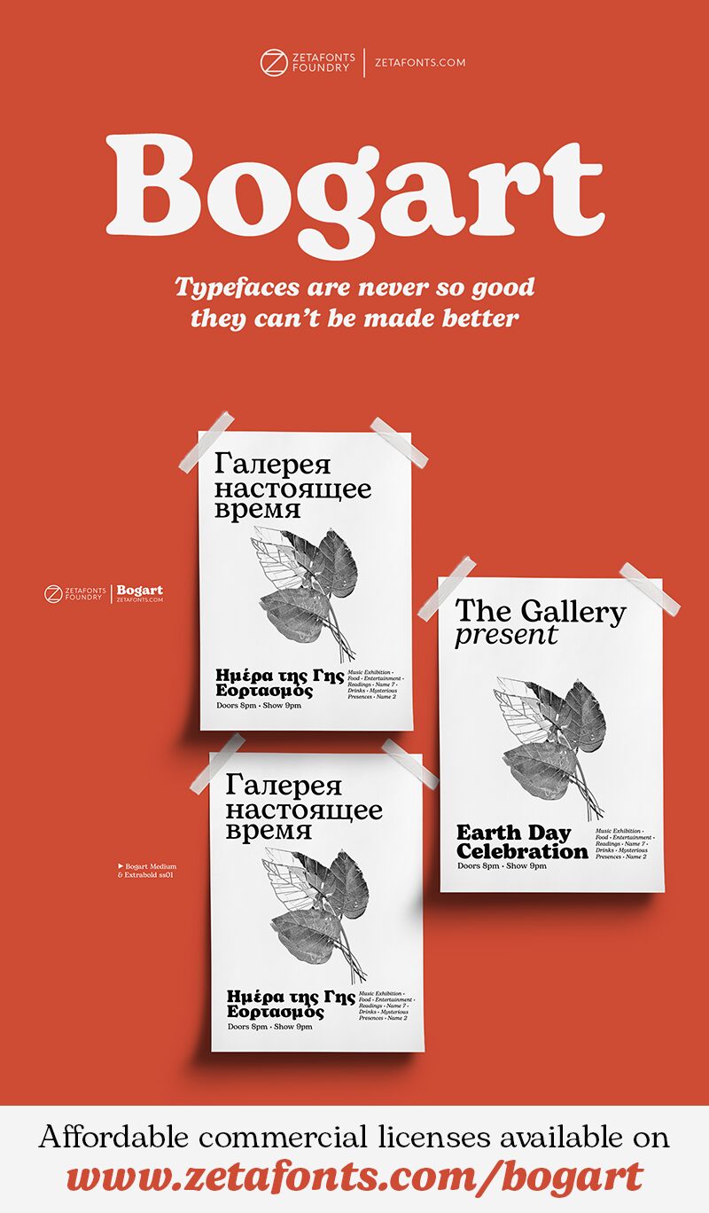
Bogart font family by Zetafonts combines humanistic flair with warmth and invigoration in a striking designed typeface. This free font family of 18 font styles presents a quirky and friendly look in a nostalgic manner. The font family is vintage inspired, but its expressiveness lies in an organic, modern design form which is also a touch playful and unassuming.
Bogart font family is best suited for use in a wide variety of branding-related projects, especially when a new brand identity needed is fresh and contemporary. Use it in websites, packaging design, or user interfaces. Other suggestions include company documents, logos, print design, magazines, covers, posters, promotional items, uniforms, and many others.
Use Bogart font family in your personal projects for free, or consider a commercial license or donation for your business works. The fonts are not suitable for commercial use.
Author's note
The font here is for PERSONAL/NON-COMMERCIAL USE ONLY!
To download the full font family (all weights, glyphs and numbers) and acquire the commercial license, please visit our website:
https://www.zetafonts.com/bogart
For more information about our licenses:
https://www.zetafonts.com/licensing
CONTACT US:
Website: https://www.zetafonts.com
Email: info@zetafonts.com
Bogart has been designed in 2020 by Francesco Canovaro as a personal homage to the iconic look of low-contrast old-style fat faces, like Cooper Black (Oswald Bruce Cooper, 1922) and Goudy Heavy Face (Frederic W. Goudy and Sol Hess, 1925-1932). Originating from the modern old style of Bookman, these muddy, goopy shapes found their pop culture iconic status thanks to rub-on transfers and phototypesetting systems in the 1960s and 1970s. Positively bursting with hippie energy and exuberant vitality, they often included an extensive repertoire of swash characters, bridging the space between lettering and typography.
In researching these shapes, Canovaro decided to include the influence of another idiosyncratic American old-style typeface, Windsor, quoting its sloping shapes and quirky solutions. He also expanded the weight range of Bogart to include a selection of display light weights where the muddy shapes of the heavy weights distill into elegant teardrop terminals. All nine weights of Bogart, as well as the matching true italics forms, feature an extended character set of over 1600 glyphs, covering 219 languages using Latin, Cyrillic, and Greek alphabets. The typeface also sports a complete set of OpenType features, including alternate forms, discretionary ligatures, small capitals, stylistic sets, positional numbers, case-sensitive, terminal and initial swash forms. To add flexibility for editorial usage, a text-oriented Bogart Alternate set of nine weights was added to the family, keeping the design more similar to its modern old-style model and allowing for a heavy, readable mid-weight range.
Hollywood icon Humphrey Bogart famously said, "Things are never so bad they can't be made worse." This typeface was named after him, aiming to embody the moody spirit of vintage typography, from film noir aesthetics to pop culture references, from joyous swash titling and logo design to strict, balanced text typesetting. Because "typefaces are never so good that they can't be made better".
