Description
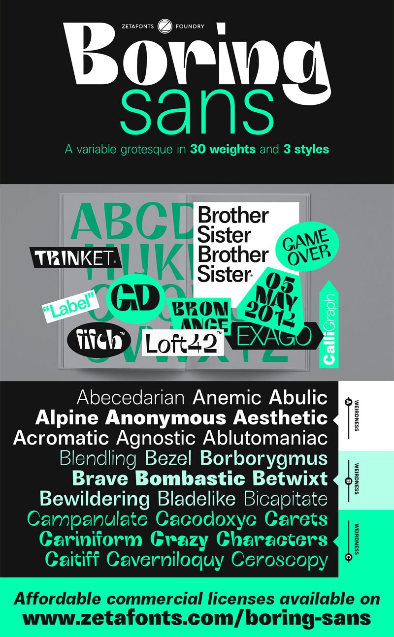
Boring Sans C font family by Zetafonts offers a free font with both a classic and modern spirit. As such, its design is both versatile and expressive, clean yet contemporary, and finished with a bold presence that makes a statement. The cheerful letter design was created by Andrea Tartarelli who offers a wide variety of weights and styles with this font, starting with the classic light type and ending with the brilliantly decorated words and colorful symbols.
Dynamic fonts each tell a different story and can be used for branding and advertising projects, signage, and publishing. They can also be combined for a versatile design for magazines or online platforms like websites. Authors need a font that catches the attention of their readers and fashion designers need an intriguing typography design for their logo, so why not give them the best tool for the job?
Boring Sans is a fine free font suitable for personal use, so any commercial projects will require a license.
Author's note
The Boring Sans font is for personal/non-commercial use only. To download the full font family and acquire the commercial license, please visit the website: https://www.zetafonts.com/boring-sans
For more information about the licensing, visit: https://www.zetafonts.com/licensing
Contact information:
Website: https://www.zetafonts.com
Email: info@zetafonts.com
Boring Sans, designed by Cosimo Lorenzo Pancini, is a typeface family designed along two variable axes: weight and weirdness. These two parameters allow designers to explore a full range of variations on sans serif design, starting from a neutral set of proportions and evolving to a strongly contrasted and dynamic treatment, ready to raise eyebrows on social media.
The basic "A" subfamily, developed in five weights plus italics, behaves like a traditional, solid workhorse sans serif, with finely tuned proportions for optimal readability and minimal emotional impact. The "B" subfamily, developed in the same ten weights, shows a more contemporary "brutal" approach, with slanted lines, deep ink traps, and stronger contrast. All these features are brought to the extreme in the ten weights of the "C" subfamily, with each letter a bombastic show of exuberant weirdness. Each of the style variants is developed in five weights with matching italics, with a glyph set covering extended Latin languages and including many alternate forms and stylistic sets.
