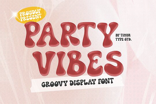
Description
Boule font family created by ingoFonts consists of 6 unique font styles in various weights and widths. Inspired by tennis balls, the typeface is a modern and playful typeface with a refreshing look that is suitable for youthful, and energetic typography projects. Boule is also a sans-serif with all the characteristics; no thick lines, uniform, and a minimalist vibe. The font provides several options for variations in width and thickness, with several letters drawn with extensions for even more originality.
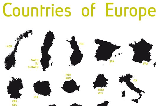
Choose Boule for all your sports-related projects like magazines, campaigns, apparel designs, and signage. The general minimalist vibe of the typeface will also make it fitting in branding and identity design, packaging, print design, and posters.
Boule is a free font for personal use. A license must be purchased for commercial use.
Author's note
Capitalized, geometric, bold, and round.
If a typographer sees a font like that, it's enough to make their toes curl. But sometimes it just has to be that way.
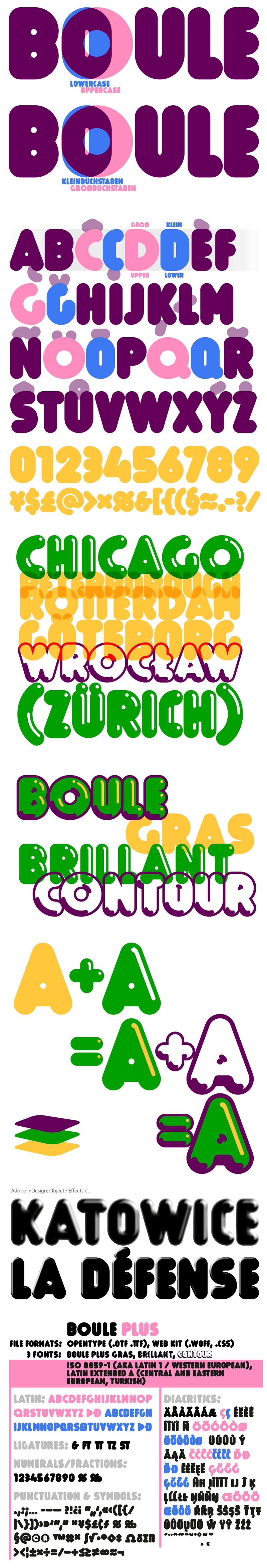
Geometrically constructed fonts do not necessarily have to be pointed and angular; they can also work consistently around. And if I say it consistently, then in this case, that's done consistently.
The basis for the Boule is the circle. The letters are drawn with constant line width, the corners and endings all have the same radius, and the lines are all the same thickness.
The Boule consists only of capitals. The only difference in the use of uppercase and lowercase letters is that the round letters are circular in the uppercase, while the lowercase letters are narrow.
The Boule is not only very fat, it also runs very tight; that is, the glyphs are very close to each other. To avoid "holes" due to unfortunate letter combinations, the Boule contains ligatures for FT, ST, TT, and TZ.
There are also other versions of the font: Boule Brillant and Boule Contour. The Boule Brillant version simulates a light incidence from the top right, giving the font a decorative effect that can evoke associations with wet sausages or balloons in some shapes. The Boule Contour is the outer contour of the letters, combined with a shadow at the bottom left.
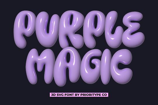
The name Boule (French for "ball") indicates that this font is globated. Therefore, it is also very suitable for all three-dimensional alienation effects. With simple light and shadow, you can achieve a very convincing 3D effect with little effort.
If a typographer sees a font like that, it's enough to make their toes curl. But sometimes it just has to be that way.
Geometrically constructed fonts do not necessarily have to be pointed and angular; they can also work consistently around. And if I say it consistently, then in this case, that's done consistently.
The basis for the Boule is the circle. The letters are drawn with constant line width, the corners and endings all have the same radius, and the lines are all the same thickness.
The Boule consists only of capitals. The only difference in the use of uppercase and lowercase letters is that the round letters are circular in the uppercase, while the lowercase letters are narrow.
The Boule is not only very fat, it also runs very tight; that is, the glyphs are very close to each other. To avoid "holes" due to unfortunate letter combinations, the Boule contains ligatures for FT, ST, TT, and TZ.
There are also other versions of the font: Boule Brillant and Boule Contour. The Boule Brillant version simulates a light incidence from the top right, giving the font a decorative effect that can evoke associations with wet sausages or balloons in some shapes. The Boule Contour is the outer contour of the letters, combined with a shadow at the bottom left.
The name Boule (French for "ball") indicates that this font is globated. Therefore, it is also very suitable for all three-dimensional alienation effects. With simple light and shadow, you can achieve a very convincing 3D effect with little effort.