Description
Bruta font family by ingoFonts is a bold, rustic, and organic font that brings an eroded feel to the characters through eroded and uneven outer edges. The 2 font styles, perfect for headline use, convey a handcrafted feel, often in uppercase for an even more impactful punch. It’s informal, textured, and appears like it was originally hand-carved out of a natural material such as wood or stone. Add more personality to your graphic design work and the emotional side of it through Bruta.
Bruta is definitely suitable for all sorts of headlines on posters, book covers, CD albums, and all other sorts of print designs. Use it online on Tiktok, and as part of your brand on Instagram, Facebook, or Youtube. Advertisements in such formats are also a strong option.
Licensed as Freeware, a Bruta license does not restrict the user from using the free font for commercial use, but no further support is provided.
Author's note
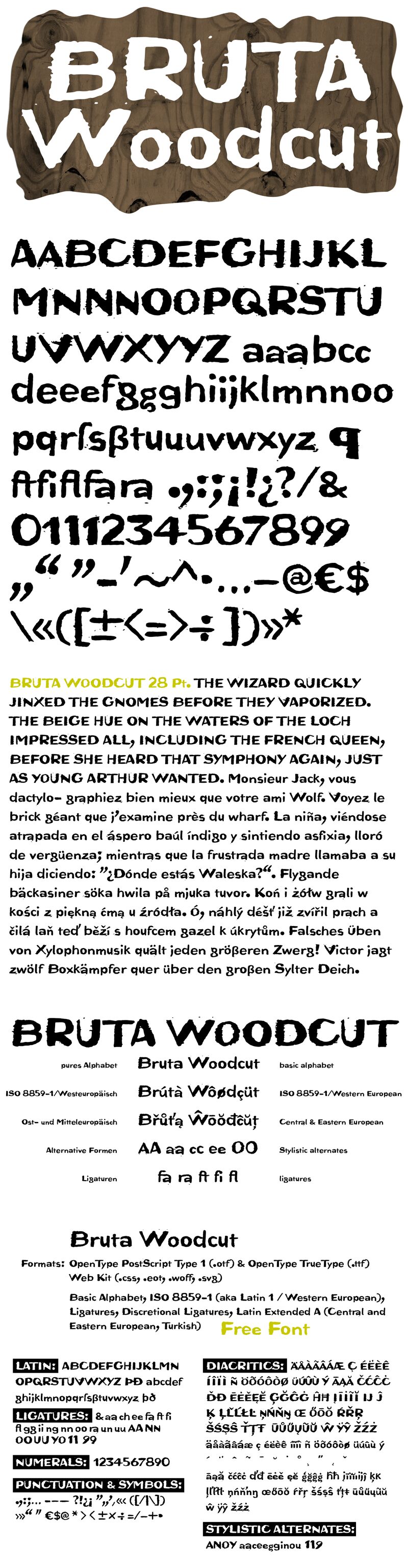
An alphabet originally carved in wood
The German term for characters or letters is Buchstaben, literally Buche (beech) and Stab (rod or stick), and dates back to the Germanic custom of carving runic characters in beechwood sticks. On New Year's Eve, 2014, I used the occasion to cut real beech characters myself. I carved all the characters of this font in woodcarving manner, without tracing and mirror-inverted, in smoothly planed beech rods. After printing on paper, the digital font you see here was created from the negative typeface.
Originally planning an alphabet of capital letters only, I ended up carving figures, punctuation marks, and lowercase letters after all. The capital letters emphasize alternation between bold and fine strokes, which is familiar in Roman typefaces. In this way, the uppercase text in Bruta Woodcut obtains its very own aesthetics.
The ductus on the lowercase letters is plainly not as distinct. They look more like a classical sans serif, which becomes clear as the smaller a text is set in Bruta Woodcut, the more legible it becomes.
The original image was negative. In contrast, the font consists of the positive typeface. Bruta Woodcut includes lots of ligatures and stylistic alternates for some symbols.
Thanks to OpenType and Unicode, Bruta Woodcut supports all Western European languages, as well as Central and Eastern European languages and Turkish.