Font
Built Titling
Author
Fonts
10
License
Downloads
1
Added
Jul 30, 2015
Updated
Jan 26, 2023
Description
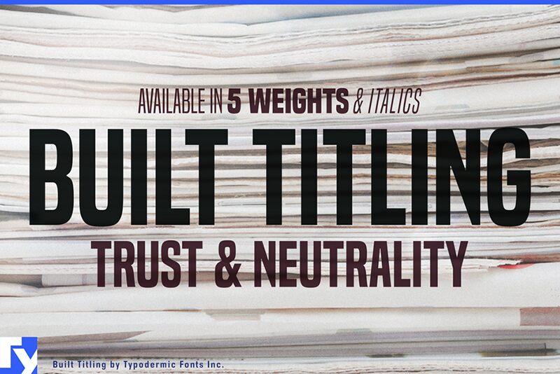
Built Titling font family by Typodermic Fonts is a modern, free sans serif font family available in 10 well-built font styles. Its professional and clean look is structured and versatile at the same time, making it suitable for impactful contemporary applications anywhere you want. Its neutral appearance gives it an interesting touch of simplicity and elegance.
Although originally industrial, its current evolution still retains original legibility, yet adds modern aesthetics. Harness the power of Built Titling whenever you want to create branding designs, advertising materials, posters, website layouts, applications, or many other graphic design projects. Immediate ideas can include uniform typography for mobile applications or websites.
Currently, Built Titling font family is released as a 100% free font to use personally or commercially.
Author's note
Built's sole purpose is to create sturdy, compact headlines on screen. Its wraparound curves project your headlines in a newsy voice, designed with trust and neutrality in mind. Subtle curls evoke the feel of a different newspaper age without appearing too old-fashioned. The Built family is available in five weights, ranging from Extra-Light to Bold. However, this is not your standard thin to fat linear range. When designing for the screen, light typefaces have practical limits. With variable resolutions and screen sizes nowadays, going lighter means going bigger. Much bigger. And it's no fun if your words slip off the page. Built becomes narrower as it becomes lighter. Now you can scale up those headlines and still have room to spare. Set appealing, oversized page titles without worrying about copyfitting.
When you have a list of numbers to align, tabular (monospace) numerals come in handy. But tabular numerals don't look good in headlines, and they take up too much room. Many fonts allow you to select between proportional and tabular numerals. Designers can use OpenType technology to access a variety of numerals, but deploying OpenType features on the web isn't always viable. Built has a simple solution: disable kerning, and all numerals, monetary symbols, and most math symbols will line up easily. Built contains fractions, primes, ordinals, and vertically compact accents. As Built loses weight, the asterisk grows more legs, allowing it to appear tonally even in Extra-Light. The italics are thin and loosened on the sides, giving cool emphasis that's more than just a simple slant. Built comes in Extra-Light, Light, Regular, Semi-Bold, and Bold weights, as well as Italics.
These fonts include a license that allows free commercial use: sometimes referred to as a desktop license. This allows you to install the fonts on a computer and use them to create posters, web graphics, game graphics, t-shirts, videos, signs, logos and more. Read the license agreement for details. If you'd like to embed these fonts in an app, on the web or anything that's not covered by the desktop license agreement, visit the link below. You'll find distributors who offer different types of licenses, or you can contact me for help.
https://typodermicfonts.com/built-for-headlines
