Font
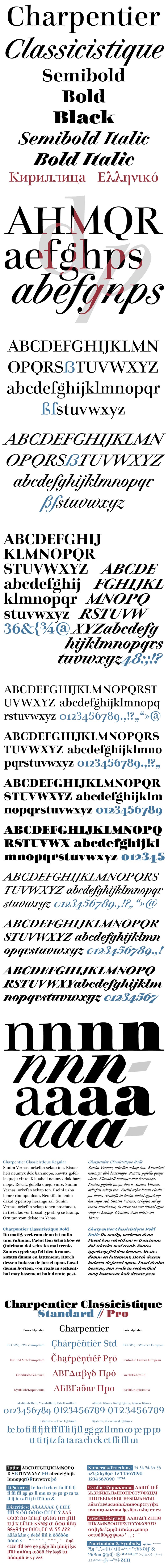
Charpentier Classicistique
Author
Fonts
14
License
Added
Sep 19, 2022
Description
Charpentier Classicistique font family by ingoFonts features 14 distinct font styles giving users plenty of room to experiment and adapt to their creative needs. The various styles offered in this font allow you to combine different styles, including bold and italics, when developing graphics. Each character in Charpentier is elegantly drawn, crafted with inspiration from classic fonts that go back centuries. Charpentier Classicistique uses refer to all the outlines and also include many more language-specific accents and special characters.
Design your next classic card, certificate, poster, or book cover with this easy-to-use typeface. Use it in developing text logos, classic signage, book covers, digital pamphlets, and various online platform graphics. Use Charpentier Classicistique in packaging designs, social media platforms, roll-up banners, print ads, and all your marketing needs.
Free font for personal use, the purchase is necessary for commercial use.
Author's note
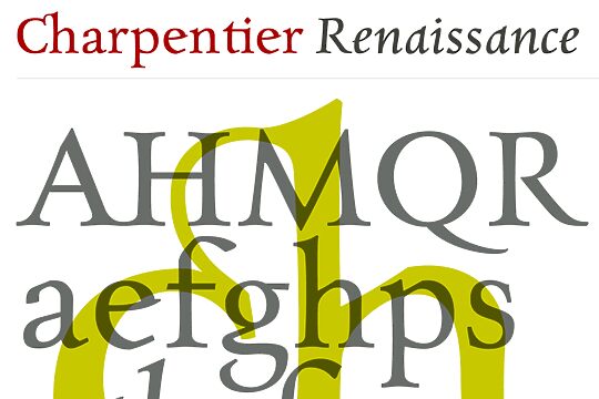
This Roman typeface has a livelier effect than is typical of the epoch of classicistic style. In the lowercase letters, an echo of the smoother forms of historically early scripts is identifiable. Typical of a classicistic Roman typeface are the emphasized and clear contrast in the weight of the strokes, the fine serifs, and the accentuation of the vertical bold stem. Charpentier Classicistique is pleasantly legible. Its effect is much less harsh than other classicistic fonts. The pointed forms of M and N are uncommon.
The italic version of Charpentier Classicistique is unusually strongly slanted. The italic lowercase letters refer, in part, to English handwriting, which also falls under classicism. Especially the curves show forms influenced by writing.
Charpentier Classicistique is available in four font weights: regular, semibold, bold, and black. Thanks to OpenType and Unicode, Charpentier Classicistique Standard and Charpentier Classicistique Pro support all European languages, including Turkish, Greek, and Russian. Both versions include lots of ligatures, also discretional ones, as well as figures for normal setting and tabular figures with constant width and cap-height figures.
The font downloadable here is a reduced version (without punctuation, ligatures, numbers, etc.). A commercial version of this font (with all features) is available at www.ingofonts.com