Description
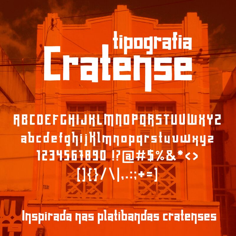
Cratense font by Lucélia Barbosa is a modernist techno font with clean geometric shapes and uniform width. Cratense was inspired by rustic techniques, architectural elements, and industrial machines from which it gets its structural look. The font draws its main inspiration from the years of both great artistic and industrial development. An informal yet precise style ideally suits it to contemporary applications in urban design and branding.
Get the font today and use it in branding projects, posters, book covers, apps, or websites. You may use it whenever you want to use a typeface that draws the reader to your content.
Cratense is a free font for personal use. However, to use it commercially, please contact Lucélia Barbosa for more usage information or donate to use.
Author's note
The goal of the "Cratense" typography was to preserve and promote the historical memory of Crato. It was inspired by the architecture of the Northeast region and developed based on photographic records of the parapets in the city center. Parapets are still very common in the city and have become a unique artistic expression of the master stonemasons, representing the identity of the small towns.
As a display typeface, it is ideal for titles and short texts.
As a display typeface, it is ideal for titles and short texts.


