Font
DeFonte
Author
Fonts
8
License
Added
Oct 18, 2005
Updated
Aug 12, 2021
Description
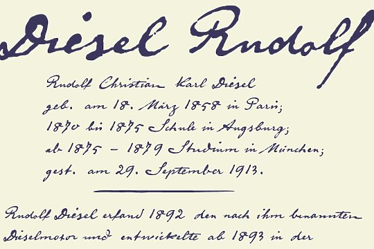
DeFonte font family by ingoFonts is a free font family consisting of 8 unique font styles. The typeface is in a category of its own due to the complexity of each glyph, achieved by adding ink delays which vary slightly throughout the family styles. If you are on the lookout for a decorated font family then this font might be exactly what you need.
With the right creative idea, the font can be beautifully utilized in magazines and brochures, page titles, artwork, posters, menus, and even certificates. Product packaging is also excellent for digital use such as social media posts and online ads.
The font family is free to use for personal purposes only. For commercial and business purposes a paid license can be purchased or alternatively, a donation can be made.
Author's note
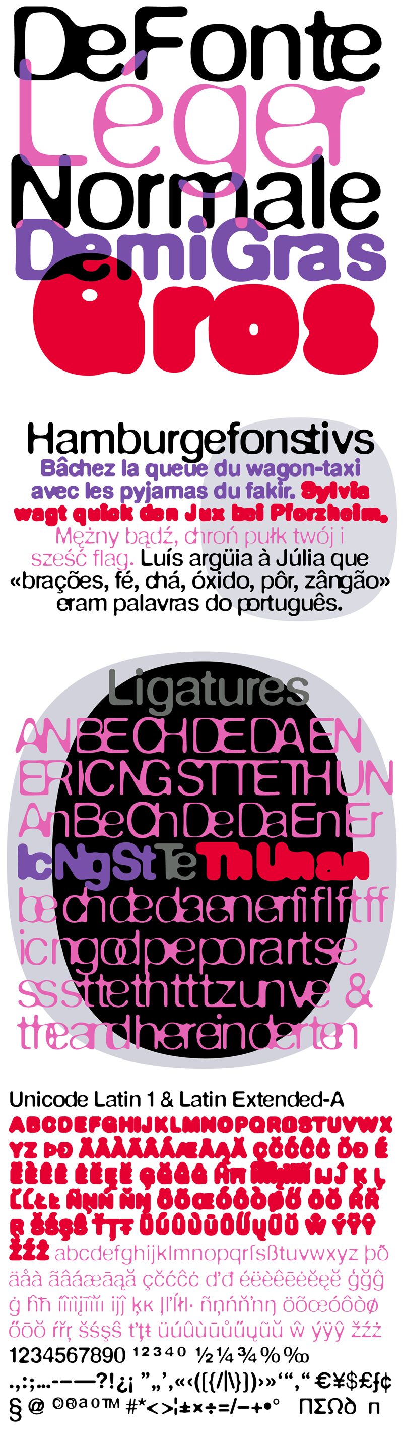
Variation of Helvetica according to the blur principle.
The underlying typeface is based on Helvetica, the quintessential typeface of the twentieth century. The distorted principle used simulates the photographic effect of halation and/or overexposure.
The light typestyle, DeFonte Leger, nearly breaks on the thin points, whereas on those points where the lines meet or cross, dark spots remain. The characters are nibbled at from the inner and outer brightness.
On the normal and semi-bold typestyles, DeFonte Normale and DeFonte Demi Gras, the effect is limited almost exclusively to the end strokes and corners, which appear to be strongly rounded off. The bold version, DeFonte Gros, is especially attractive. As a result of overexposure, counters (internal spaces) are closed in, while characters become blurred and turn into spots; new characteristic forms are created which are surprisingly legible.