Description
Faber Sans Pro font family is a free and functional sans serif font by ingoFonts with clean modern aesthetics. Its design is distinguished by flexibility and versatility making it easily adaptable to a wide range of themes. This contemporary professional text is expressed in a minimalistic style which enhances its readability and performance.
Like most sans serifs, the font is suitable for digital designs, branding, and can be used in websites or mobile applications. Because of its subtlety and elegance, you can opt for this display in your next professional project. Other possible usages include signage, magazine covers, promotional ads, and so on.
This free font cannot be used for commercial purposes unless a license is secured or a donation is made to the author.
Author's note
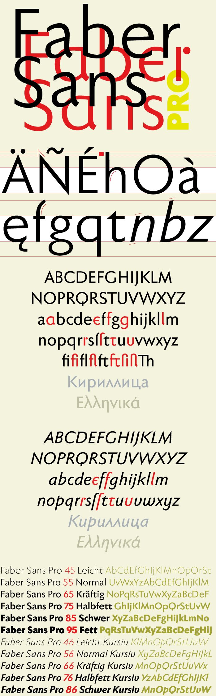
Two fonts in one: a classic-modern sans serif appearing in two forms - "standard" and a "stylistic alternate" with uncial script-oriented characters which give the font a completely different "look."
The idea for one of the very first ingoFonts, the sans serif "Faber Eins & Zwei," originated in 1996. This typeface gained popularity over the years, especially in English-speaking countries. A lot has changed since then - not just in font technology. In 2010, it was time for a basic revision of this attractive font, and time to bring it up to date with current font technology.
A uniqueness of Faber Sans Pro is that it is actually composed of two fonts. The "basic typeface" is a sans serif in the classic-modern style of type creations of the early 20th century, inspired by Futura from Paul Renner and Gill Sans from Eric Gill. The Roman Capitalis provided the model for the classically proportioned capital letters, and the harmonic shapes of the humanistic minuscule for the lowercase characters. This resulted in a font with pleasant rhythmic proportions that is extremely comfortable to read, especially in large amounts of text, while also being reader-friendly under adverse typographic conditions on the monitor.
A "second" typeface with its own personal character resulted as stylistic alternates were designed for the letters a, e, f, g, l, t, and u in accordance with the uncial scripts of the late antiquity or early Middle Ages. Additionally, the r is given a playful point in the stylistic alternates. Modern OpenType technology makes it possible to combine the previously separate typefaces into one font. The stylistic alternate can be accessed via the OpenType Functions Discretionary Ligatures or Stylistic Alternates (and of course the glyph panel).
Unlike classic sans serifs, Faber Sans Pro includes a "true" italic. The italic characters are not simply slanted variations of the upright, but the characters originated from handwriting styles; they are rounder, and the stroke flow is more fluent than on the upright letters. Some italic letters truly have their own design, which clearly comes from handwriting, particularly noticeable on a and g.
At ingoFonts, all fonts can be downloaded gratis (free of charge). However, the files offered here to download contain only a reduced font, consisting of uppercase and lowercase letters from A to Z. The complete font, including numerals, umlauts, punctuation, and especially ligatures, is only available with your order and payment.