Font
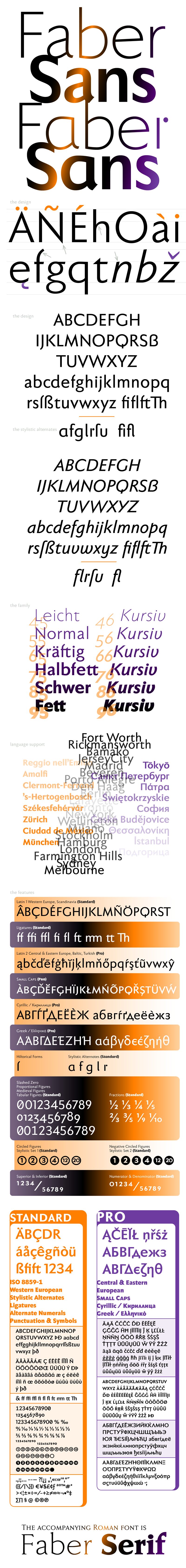
Faber Sans
Author
Fonts
48
License
Added
Nov 14, 2011
Updated
Aug 12, 2021
Description
Faber Sans font family by ingoFonts is an exceptionally versatile font family reminiscent of Futura and other geometric sans serifs from nearly a century ago. With 48 font styles to choose from, this wide-ranging collection is reminiscent of a time when letters were not handwritten, but constructed with geometrical aids. With a strict form of geometric shapes, Faber Sans is a font family that is ideal for use in a wide range of visual and print media.
This geometric sans serif font family is suitable for editorial design, advertisements, posters, logos, packaging, signage, and more. Designers can make the most out of the different widths and weights to either create a unique identity or match with an existing one. Additionally, the font family transforms well on websites.
Faber Sans is free for personal use with a license needed for commercial purposes. Interested users can make a donation to acquire the full license from the provider.
Author's note
The classic-modern sans serif
Faber Sans is a sans serif in the classic-modern style of type creations of the early 20th century, influenced by Futura from Paul Renner and Gill Sans from Eric Gill. This font has pleasant rhythmic proportions, making it extremely comfortable to read, especially in large amounts of text. It is also reader-friendly under adverse typographic conditions on the monitor.
A distinguishing feature of Faber Sans is the terse character of the 'f', with a shortened ascender and without the usual sweeping bow in reading order.
The determining element in the appearance of Faber Sans is the wide, round forms of b, c, d, e, o, p, q, C, D, G, O, and Q. This formal characteristic is even more emphasized with the use of the round 'a' and 'g' in the stylistic alternates. The soft, round forms are contrasted by the points of all characters derived from the triangle: v, w, z, and especially the capitals A, M, N, V, W, and Z.
A second typeface with its own personal character resulted from the design of stylistic alternates for the letters a, f, g, l, t, and u, drawing inspiration from the uncial scripts of the late antiquity or early Middle Ages. Additionally, the 'r' is given a playful point in the stylistic alternates.
Unlike classic sans serifs, Faber Sans includes a true italic. The italic characters are not simply slanted variations of the upright forms, but rather originated from handwriting styles. They are rounder, and the stroke flow is more fluent than on the upright letters. Some italic letters, particularly the 'a' and 'g', have their own distinct designs that clearly come from handwriting.
The font downloadable here is a reduced version, without punctuation, ligatures, or numbers. The full commercial version of this font, with all features, is available at www.ingofonts.com