Description
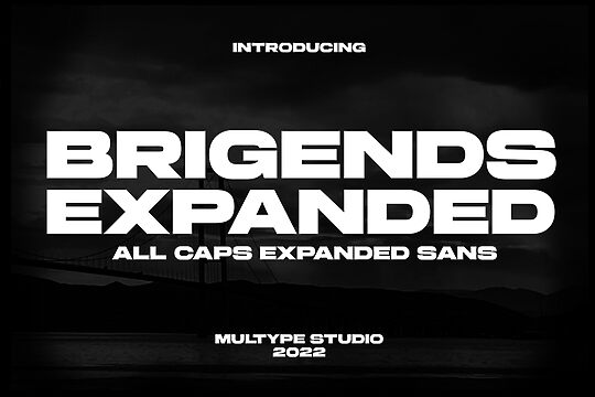
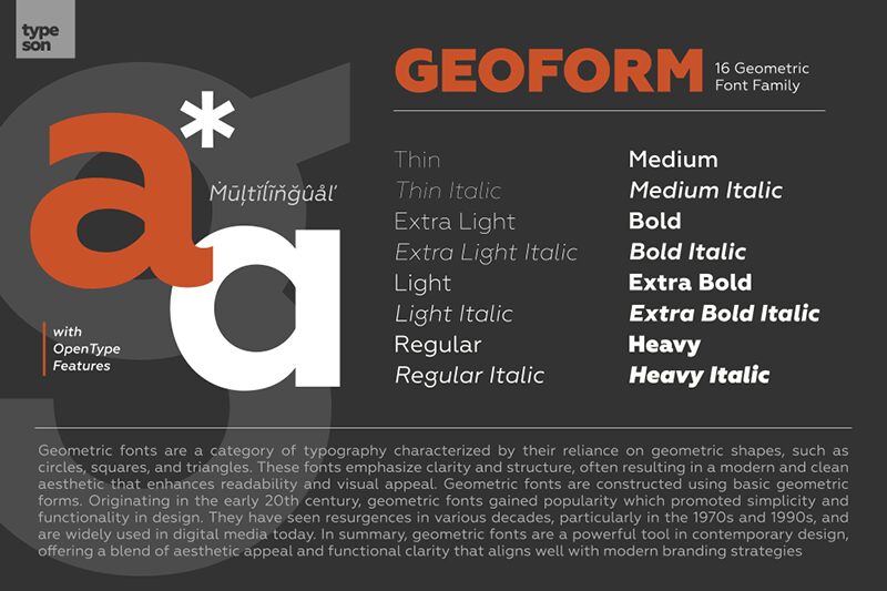
Geoform font family contains 16 font styles with a minimalistic and structured design. Designed by Typeson as a free font, the family is built around simplicity and functionality. A sans serif with the typical geometric approach, it lets balance, clarity, and structure all the way in a contemporary style. Some of the visual features that help the fonts accomplish that are its angular verticals and horizontal lines, and a medium width and weight. The file furthermore is characterized by a nice flow and connectivity appropriate for most professional design projects.
The font is versatile with superb legibility and a comfortable appearance. It should therefore match for multiple-size layout books, posters, albums, brochures, branding, taglines, etc. Branding both on a personal and corporate level is possible with Geoform fonts as well as campaigns for digital media. With an approachable, pleasant, and contemporary presence, headlines, body text, magazines, editorials, posters, and web designs are other acceptable applications.
The usage rights for the Geoform font family by Typeson are referred to as freeware which shouldn’t be a concern for commercial use unless different conditions apply to the designers.
Author's note
Geometric fonts are a category of typography characterized by their reliance on geometric shapes such as circles, squares, and triangles. These fonts emphasize clarity and structure, resulting in a modern and clean aesthetic that enhances readability and visual appeal. Constructed using basic geometric forms, geometric fonts originated in the early 20th century and gained popularity for promoting simplicity and functionality in design. They have experienced resurgences in various decades, particularly in the 1970s and 1990s, and are widely used in digital media today.
In summary, geometric fonts are a powerful tool in contemporary design, offering a blend of aesthetic appeal and functional clarity that aligns perfectly with modern branding strategies.
For more information, visit:
www.fontwebsite.com
In summary, geometric fonts are a powerful tool in contemporary design, offering a blend of aesthetic appeal and functional clarity that aligns perfectly with modern branding strategies.
For more information, visit:
www.fontwebsite.com