Font
Holden
Author
Fonts
3
License
Added
Nov 28, 2018
Updated
Nov 30, 2018
Description
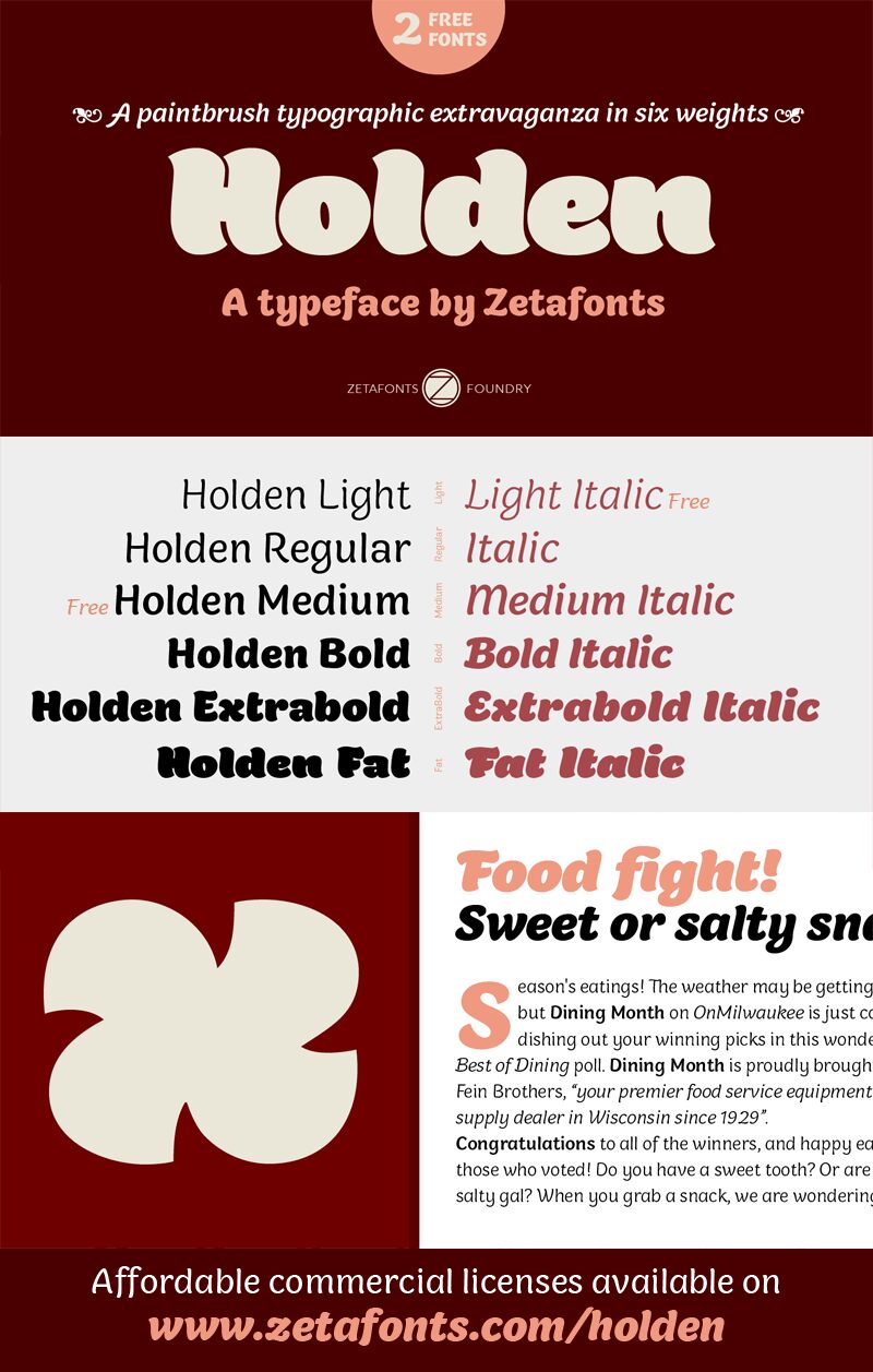
Holden font family by Zetafonts is a free font family with an attracting contemporary flair. It comes with design details that make it loud and visible, making it ideal for making a striking statement. Its rounded letterforms give it a casual and less serious feel while still managing an attractive visual.
This font is suitable for headlines, magazines and editorial layouts, retail branding, logos, print, and online ads, as well as packaging and other versatile uses. Incorporating it into social media posts, flyers, posters, brochures, videos, and online content in general can provide attention with its friendly appearance.
Holden is free for personal use only, while a commercial license is also available. Consider donating to the author to support their work.
Author's note
This font is for PERSONAL/NON-COMMERCIAL USE ONLY!
Download full version and commercial license:
http://www.zetafonts.com/holden
For more info about our licenses:
http://www.zetafonts.com/licensing
Holden is a typeface family designed in 2018 for Zetafonts by Cosimo Lorenzo Pancini with Andrea Tartarelli as a research in texture and extreme weight range. Its curvy shapes, inspired by pointed brush aesthetics, are developed in six different weights, from the lightly contrasted thin to the fluid and rhythmic fat.
The lightest weights are mostly designed for text usage, while the heavier weights work better at display sizes, where the extreme shapes and tight counter-spaces are better appreciated.
Holden aims to fill the space between display and text typeface, with a range of variants that allows maximum expression in display use and great legibility in long texts, on the web and at small size. Holden is designed for editorial or packaging use where a contrasting range of weights and variants is required to fight monotony while keeping branding consistent.
All Holden fonts include full open type features with stylistic alternates, small caps, discretionary ligatures, positional number forms, swash forms (in italics) and full language coverage for over 70 languages using the Latin alphabet.
An array of extra decorative dingbats are included to complement your design with pointing manicules and fleurons (also called "horticultural dingbats" by Robert Bringhurst in The Elements of Typographic Style).
