Font
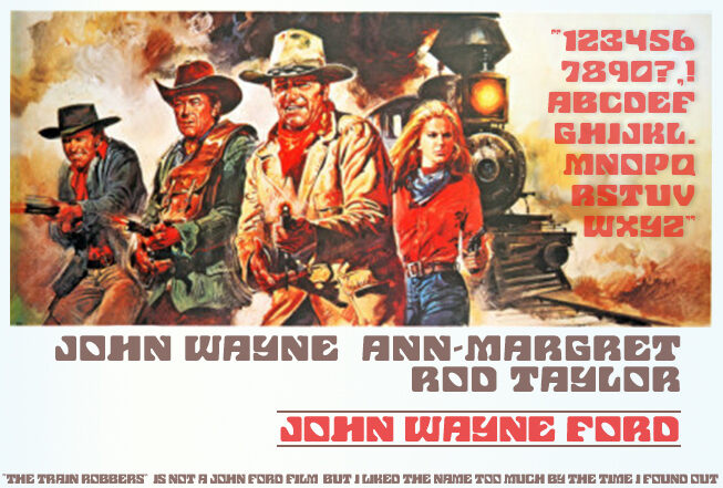
John Wayne Ford
Author
Font
1
License
Downloads
1
Added
Feb 2, 2014
Description
John Wayne Ford font designed by Hugo Beyts is a fancy handwritten script font stemming its inspiration from the legendary American actor. With a rugged character, bold presence, and distinguished sturdy style, this font can help you achieve a commanding visual output. Most of its attributes are influenced by designs of the 20th century. Its classic aspect is dominated by elements that are striking, retro, and masculine.
Use John Wayne Ford font for branding projects, website designs, social media content, posters, logotypes, advertising material, TV, and video. Apparel, clothing, stationary, and packaging design become easily accomplishable projects.
This font is free for personal use only with a commercial license available for purchase.
Author's note
Based on the font used in the poster for "The Train Robbers," the film was likely released in the 1970s. The font is reminiscent of the slab-serif typefaces popular during that era, such as Clarendon or Egyptian. This style was often used for Western-themed media, conveying a rugged and masculine aesthetic.
The Train Robbers was directed by Burt Kennedy and starred John Wayne, Ann-Margret, and Rod Taylor. It tells the story of a widow who hires a group of aging outlaws to help her recover a cache of gold stolen by her late husband. The film was a box office success, earning over $7 million at the time of its release.
The use of this distinctive font on the movie poster helps establish the setting and tone of the film. It immediately communicates the Western genre and the gritty, adventurous nature of the story. This typographic choice was a common technique in movie marketing during the 1970s, allowing filmgoers to quickly identify the genre and style of the production.


