Description
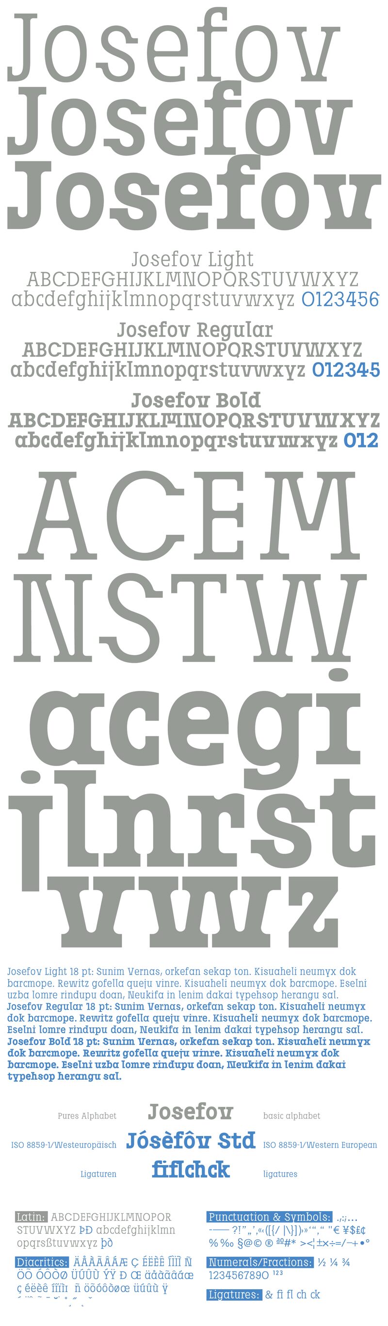
Josefov font family by ingoFonts is an unconventional modern typeface inspired by the historical Hebrew scripts of Prague’s old Jewish town. The versatile family is fully geometric, which gives it a rather playful and expansive structure with many corners. This quick and wide construction feels playful alongside the slightly bracketed and playful serifs where they appear. Some ligatures interact similarly with the body of letters alongside a very geometric design equal in measure to others.
Josefov offers an otherwise uniform and regular design with light, regular, and bold weights. Used widely in creative designs that aim to inspire, this free font is ideal for branding, logo design, poster design, magazines, and packaging projects. Create amazing headings, titles, and even body text with this enchanting typeface.
Free for personal use, a license may be required for commercial use.
Author's note
JOSEFOV is directly derived from the sans serif text font Josef, as the name implies.
Here also originates the touch of the unusual relation of large x-height to the very short ascenders, even for modern serif fonts. The basic thought was to create a font with heavy rounded serifs in the style of Clarendon but which hardly reminds one of that particular font. In addition, the form principle of rounded serifs is applied whenever possible, for example at the points where the individual strokes of the characters join one another.
JOSEFOV seems very technical and constructed (and truly is). In order to soften up the rigid impression, the serifs are applied at some points contrary to the tradition handed down, as with the upper case A, C, G, K, M, V, and W, and the lower case a, b, d, h, i, j, k, l, s, and t. Historically, there is no example of the laterally oriented serifs of capital and small s (S) and C, G. On the other hand, the double-sided serifs on the stems of b, d, h, k, and l appear at the beginning of modern times in the very first serif types from Sweynheim and Pannartz and others. The double-sided serifs of A, M, V, and W were also customary in the first decades of printing.
The font downloadable here is a reduced version (without punctuation, ligatures, numbers, etc.). A commercial version of this font (with all features) is available at www.ingofonts.com