Description
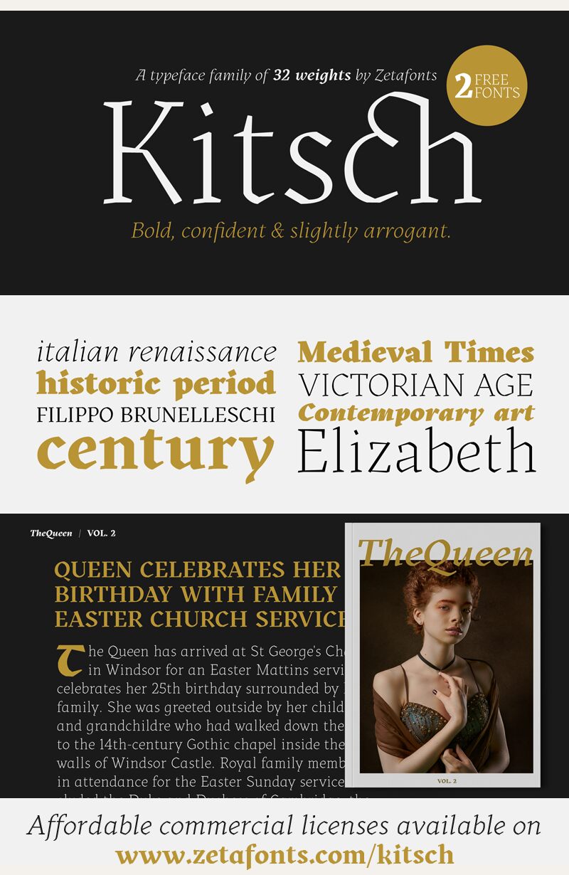
Kitsch font family by Zetafonts brings a free artistic serif addition available in 2 font styles. The elegant letters present a sophisticated architecture prepared for both classic and contemporary designs with special aesthetics and sensations users are meant to experience. The design is subtle and beautiful, and it brings inspiration from old eras and renowned art pieces. However, it is still characterized as a modern typeface for future projects.
The versatile Kitsch features historic-influenced letterforms with artistic iconic elements and a modern twist. Bring elegance and luxury to your printed notebooks, monogrammed projects, magazines, and branding designs. Benefit from its professionalism with UX and UI designs, applications, websites, dashboards, and other digital interfaces.
This free font file is free for personal use, and commercial projects require a license. If it turns out to be a great match for your professional artwork, you can purchase it or donate to the author as a sign of gratitude.
Author's note
The font here is for PERSONAL/NON-COMMERCIAL USE ONLY!
To download the full font family (all weights, characters and numbers) and acquire the commercial license, please visit our website: https://www.zetafonts.com/kitsch
For more information about our licenses, please visit: https://www.zetafonts.com/licensing
CONTACT US:
Website: https://www.zetafonts.com
Email: info@zetafonts.com
Designed by Francesco Canovaro with help from Andrea Tartarelli and Maria Chiara Fantini, Kitsch is a typeface happily living at the crossroads between classical Latin and medieval Gothic letterforms. Rather than referencing historical models like the Italian Rotunda or the French Bastarda scripts, Kitsch tries to renew both its inspirations, finding a contemporary vibe in the dynamic texture of the calligraphic broad-nib pen applied to the proportions of the classical Roman skeleton.
The resulting high contrast and spiky details make Kitsch excel in display uses, while a fine-tuned text version manages to keep the dynamic expressivity of the design without sacrificing legibility, even at small sizes. Both variants are designed in a wide range of weights, from the almost monoline thin to the dense black, and are fully equipped with an extended character set covering over two hundred languages that use Latin, Cyrillic, and Greek alphabets.
Special care has been put into designing Kitsch's italic letterforms, with the broad-nib movements referencing classical Italian letterforms to add even more shades to your typographic palette. The resulting alternate letter shapes have also been included in the roman weights as Stylistic Alternates, part of the wide range of OpenType features (Standard and Discretionary Ligatures, Positional Numerals, Small Caps, and Case Sensitive Forms) provided with all 32 weights of Kitsch.
Born for editorial and branding use, Kitsch is fashionable but solid, self-confident enough to look classic while being ironic enough to be contemporary.
