Description
LT Asus font family by LyonsType contains 12 styles of free sans serif fonts. This modern font family combines minimalist ideas with a clean geometric design to create an overall streamlined look. It is a simple, sleek, and contemporary typeface with a sophisticated soul.
Many known uses exist for sans serif fonts such as LT Asus including: logos, branding, packaging, typography art, poster design, social media imagery, website usage, blogs, and many others. The font family is also a good pick for inside books and magazines.
Licensing for the LT Asus family is categorized under freeware with rights available for personal and commercial usage.
Author's note
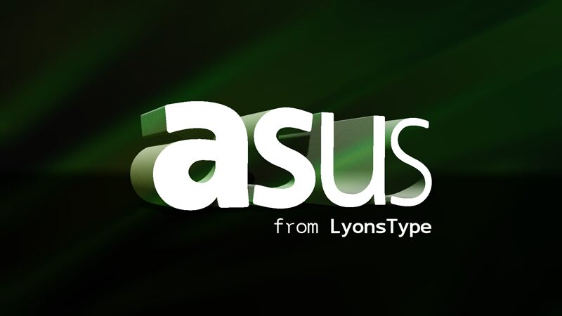
Asus is a typeface that is designed to be digital-device ready, with a focus on digital neutrality. The name "Asus" is derived from the founder's computer vendor Asus/Republic of Gamers, and the typeface includes monospace variations to give it a real digital perspective.
Asus features a distinctive design with round corners and a sense of solidity and humanism. It is not meant to follow a traditional sequence, but rather to add a sense of lightheartedness to digital brands and projects. The typeface is suitable for a variety of applications, including technology, epic projects, personal banners and signage.
The monospace variant of Asus is particularly useful for terminal emulation, programming, and other applications that require a monospace typeface. This variant maintains quality at a 12-point size, regardless of the style.
Like other gaming-inspired fonts, Asus has a resilient sense of robustness, with letter proportions and other aspects that contribute to its flexibility and usability in digital contexts. The typeface is not too edgy or difficult to read, but rather strikes the right balance of readability and digital aesthetics.
The Asus type family includes 4 roman styles, 4 italics, and a monospace variant with 2 italics. The available styles are Light, Light Italic, Regular, Italic, Bold, Bold Italic, Heavy, Heavy Italic, Mono, Mono Italic, Mono Bold, and Mono Bold Italic.