Font
Maiers Nr.21
Author
Fonts
6
License
Added
May 22, 2007
Updated
Aug 10, 2021
Description
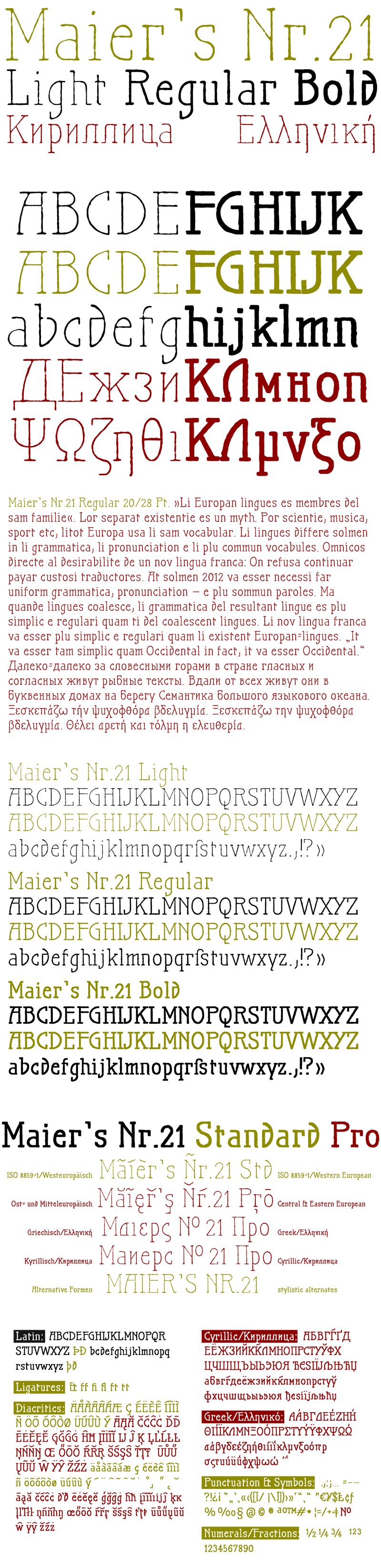
Maiers Nr.21 font family by ingoFonts captures a retro aesthetic with six remarkable font styles. This free font family introduces a distinctive character that calls to mind hand-lettered signage with a rustic, vintage feel. Its slightly informal charm is both warm and expressive, designed to enhance everything from simple typographic messages to more complex layouts.
This unique character makes it versatile for branding projects, invitations, or artistic publications. It can also be used for blog designs, posters, greeting cards, flyers, banners, T-shirts, movie cover titles, social media posts, inspirational quotes, and many other personal and commercial projects.
Maiers Nr.21 is available for free personal use. A license must be purchased before any commercial usage or alternatively a donation paid to the author.
Author's note
Very geometrical, rigid forms borrowed from the typical characteristics of Jugendstil/Art Nouveau.
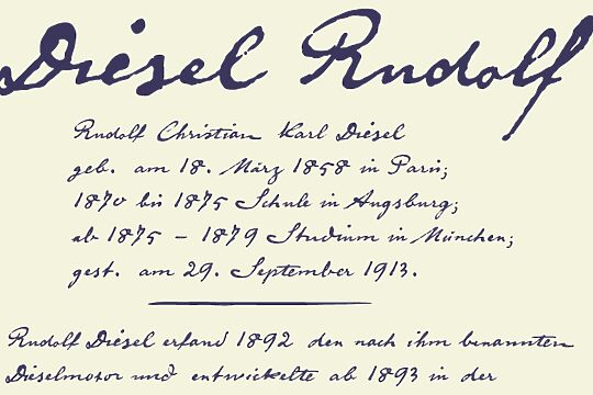
This script is found in a magazine from the Otto Maier publishing house, Ravensburg, which was issued sometime in the years shortly before World War I. The magazine is entitled "Collection of scripts for technical specialists: reduced scripts of the most significant alphabets" and published by Karl O. Maier. The original copy, produced by means of a galvanized plate, is just 7 centimeters wide. It served as the model for technical professions in which, at that time, the captions of drawings were still done by hand.
The characters have been scanned, digitized, and greatly magnified. Special attention was given to ensure the uneven edges, typical of handwritten script, remained effectively noticeable even in the digitized form. As a result, this technical font retains a handmade touch.
Especially worthy of note are the Jugendstil forms characteristic at the turn of the 19th century.
In comparison, many alleged ultramodern font types of today suddenly look quite old-fashioned.
The font downloadable here is a reduced version (without punctuation, ligatures, numbers, etc.). A commercial version of this font (with all features) is available at www.ingofonts.com