Description
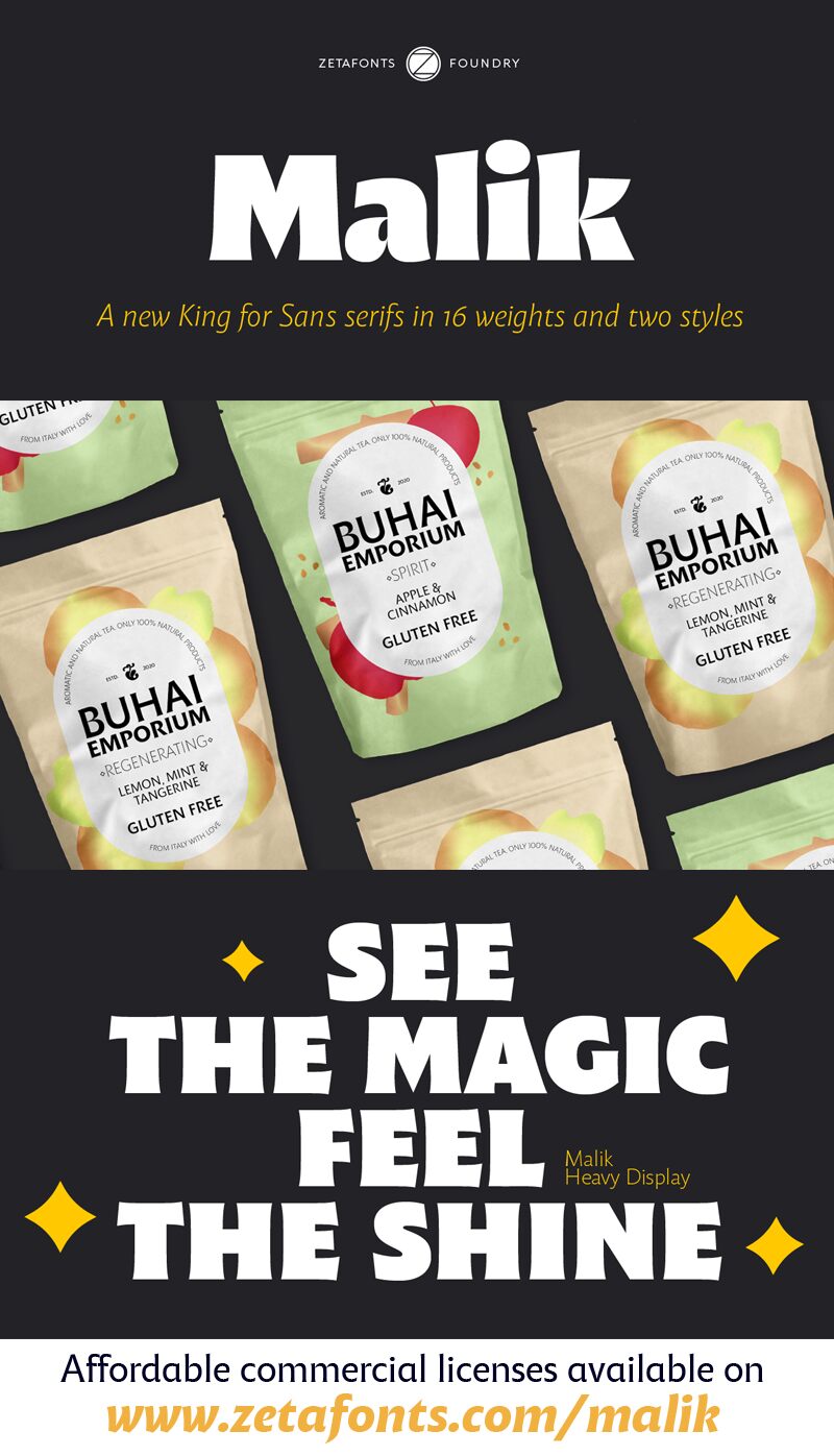
Malik font family designed by Zetafonts contains 16 font styles. This free font family encompasses a sleek yet commanding presence and a modern, geometric essence. Striking and versatile, its simple influences make it suitable for dating back into history. The lines are clean, promising, smooth, and have a slight playful vibe for best enjoyment. The visual impact the font brings with it has a contemporary twist evident in legibility and elegance also noted upon closer inspection.
Malik font might be chosen for display or body typography for fashion brands, food packaging, website design, mobile apps, beauty product packaging, posters, business cards, postcards, and envelopes.
The font is free for personal use only and would require buying a commercial license otherwise. Commercial licenses and/or a donation would allow for the designer’s support for new creative works.
Author's note
The font here is for PERSONAL/NON-COMMERCIAL USE ONLY!
To download the full font family (all weights, glyphs and numbers) and acquire the commercial license, please visit our website:
https://www.zetafonts.com/malik
For more information about our licenses:
https://www.zetafonts.com/licensing
CONTACT US:
Website: https://www.zetafonts.com
Email: info@zetafonts.com
Taking its name from the Arabic word for "king," Malik is a flared sans serif typeface family designed in 2020 by Andrea Tartarelli. The designer wanted to find a way to bridge the classical letterforms of Roman Old Style typefaces with the readability of contemporary sans typefaces. This was achieved by using the so-called flared serif that emerges gradually from the stem of the letter, ending in a sharp angle. It's something that also reminds of the peculiar shapes of the Simoncini Method, invented by Italian type designer Francesco Simoncini to get a sharper definition of letterforms. To this blend of classical elegance and modernist expertise, Malik adds the calligraphic influence of modern masters like Frederic Goudy or Ed Benguiat, visible in signature details like the reverse contrast uppercase B, or the calligraphic lowercase k.
Malik also means "owner," and this font surely wants to rule the page. It manages to be extremely readable when used in body text size, but looks surprising and expressive in display use. The inclusion of the Malik Heavy Display weight, with its black texture balanced by deep inktraps, allows for striking logo design. The weight range of the family is extremely wide, including a Book alternative to the Regular weight for fine-tuning readability, a range of light display weights, and a solid choice of bold weights for branding, all coming with matching true italics. The 16 cuts of Malik have been equipped with all the features you need to solve your editorial and design challenges, including a wide language coverage (thanks to over one thousand Latin and Cyrillic characters) and a complete set of OpenType features (including small capitals, positional numbers, case-sensitive forms). Alternate characters and stylistic sets allow you to fine-tune your editorial and branding design by choosing variant letter shapes.
Malik is the typeface for everyone who wants to design like a king...or like they don't care who the king is!
