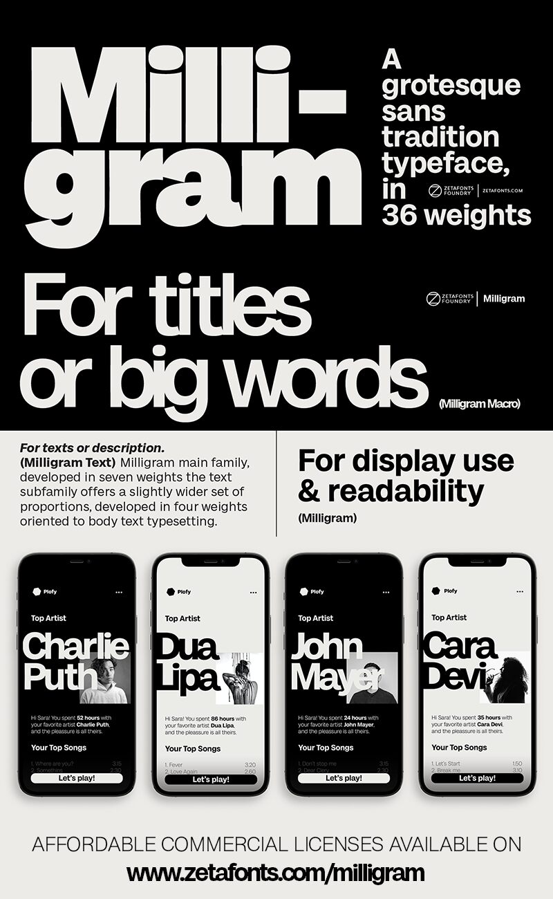
Description
Milligram font family is 14 geometric sans-serif fonts with a uniform and modern look from Zetafonts. With mostly wide, clean curves, Milligram is legible and stylish in nearly any context. The bold characters feature a combination of perfectly round and flat shapes connected through a smooth flow. In parallel with a contemporary and minimal appeal, Milligram holds the essential qualities of an amazing marketing or branding display typeface nowadays.
Use Milligram for sophisticated headlines and titles for fashion magazines, lifestyle blogs, or trendy online shops. Print product catalogues for luxury fashion brands, beauty products, or architecture and interior businesses. It’s also a suitable typeface for infographics, book covers, product packaging, invitation cards, etc.
This free font is available for personal use; a license is required for any commercial purposes. Consider purchasing a commercial license to support the authors.
Author's note
The font here is for PERSONAL/NON-COMMERCIAL USE ONLY. To download the full font family (all weights, glyphs and numbers) and acquire the commercial license, please visit our website: https://www.zetafonts.com/milligram.
Join the exclusive Type Club to get free fonts and special offers on new releases: https://www.zetafonts.com/typeclub.
CONTACT US:
Website: https://www.zetafonts.com
Email: info@zetafonts.com
Grotesque sans typefaces are timeless classics. Just when you think one Swiss font is enough, a new specimen from the past invites you to explore modern interpretations of the minimalist letterforms. This design space is highly competitive, so the differences are subtle and almost imperceptible. To work with these shapes, you need an eye for the infinitesimal, whether you aspire to be a design god or the devil in the details.
The interplay of modernist precision and the energy of vintage lead grotesques creates a delicate equilibrium. The resulting typeface develops an idiosyncratic relationship with negative space, inspired by the tight metrics that modernist designers imposed on their layouts. While the text subfamily optimizes spacing, the Milligram Tight Variant plays with a feeling of attraction behind the shapes, taken to the extreme in its logo-oriented design.
Designed by Cosimo Lorenzo Pancini and Andrea Tartarelli, Milligram is a fine yet bold homage to the Akzidenz Grotesk that never was.
