Font
Milligram Macro
Author
Fonts
14
License
Downloads
1
Added
Oct 17, 2022
Description
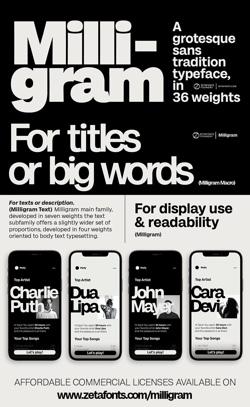
Milligram Macro font family by Zetafonts consists of 14 font styles whose character set comes in a sans serif form. Some of the keywords that can help us define the main characteristics of this free font family are clean, modern, minimalistic, versatile, contemporary, and professional. Due to its flexibility, high functionality, and practical design, it solves a bulk of problems that are common to certain projects.
Legible in small sizes and well-designed to grab attention and keep it, this resource comes in handy for a wide range of applications. Use it in websites, mobile applications, interface designs, navigation systems, maps, and car dashboards. The font can also stand out in a purely visual manner when applied to logos, posters, banners, and even book covers, or other editorial designs.
Download Milligram Macro for personal use only; purchase a license for commercial projects.
Author's note
The font here is for personal/non-commercial use only. To download the full font family (all weights, glyphs, and numbers) and acquire the commercial license, please visit our website at https://www.zetafonts.com/milligram. Join the exclusive Type Club to get free fonts and special offers on new releases at https://www.zetafonts.com/typeclub.
For more information, you can contact us through our website at https://www.zetafonts.com or email us at info@zetafonts.com
Grotesque sans typefaces are timeless classics that never go out of style. Just when you think one Swiss font is enough, a new specimen from the past arrives, inviting you to try new takes on modernist letterforms. It's a tight and crowded design space, so design decisions are subtle and almost unnoticeable. To work with these shapes, you need a taste for the infinitesimal, whether you choose to be the God or the Devil in the details.
The design of this typeface reflects a delicate equilibrium between modernist precise ideals and the fascinating energy of old lead grotesques. The resulting typeface develops an idiosyncratic relationship with negative space, inspired by the tight metrics modernist designers imposed on their layouts. While leaving text-optimized spacing to the text subfamily, Milligram plays with a feeling of attraction behind the shapes, taken to the extremes in the logo-oriented Milligram Tight Variant.
Designed by Cosimo Lorenzo Pancini with Andrea Tartarelli, Milligram is a fine but bold homage to the Akzidenz Grotesk that never was.
