Description
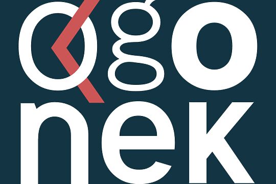
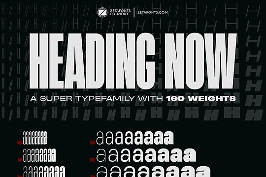
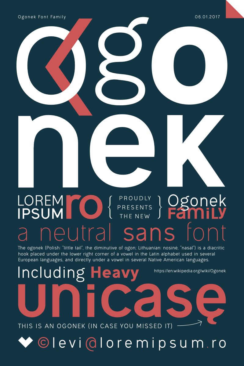
Ogonek font family by Levi Szekeres comes with 7 font styles that share a geometric minimalist structure. Each font which inherits its characteristics offers a clean contemporary visual language that can easily be worked into different types of projects. The modern free font family includes all basic characters, numbers, punctuation marks, and multilingual characters, covering most Latin scripts.
Use it for logo design, packaging, branding, promotional materials, titles and headers, printed materials including magazines, newspapers, and books, or digital designs like websites and apps.
Ogonek is free for personal use only which means that a purchase and donation will be needed to obtain a commercial license.
Author's note
Ogonek was created with the express role of having a neutral, unsophisticated, easily readable, but hardly identifiable font, worthy of any lorem ipsum text - a case when no obvious font style is needed to distract the reader (imagine a dummy text with a dummy font!), removing hints of Arial or Helvetica and leave everything to the pure act of reading, even if at its core it's a Swiss Gothic font design and the basic character construction rules cannot be overlooked.
In order to create a simple and "easy-to-follow" font, generous spacing was added to the letters and words, extra shapes and angles were used at a minimum, and the open curves kept at a fair distance to allow more space in the paragraph.
If I had to describe it, it would be "just another random sans font like all the others," and that's what I'm after. A font with familiar shapes, created for their sole utility of forming a sentence, but one that reminds me of each favorite sans. To be honest, Ogonek was born out of a personal frustration regarding sans fonts, where at least one character always seemed out of place, when "not every song of the album is a top ten material." This won't make Ogonek a remix; this can go as a synthesis of most of the things I learned and loved so far in a sans font.
Something between niche and cliché, to please my eyes from A to Z.