Description
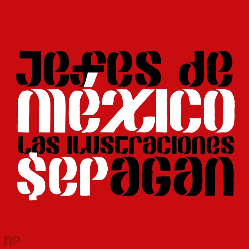
Sepagan font by Raul Plancarte is a fancy font built with a contemporary artistic touch. It has a modern yet structured design that can accommodate a wide range of designs. The font’s beauty lies in the overall advanced look it delivers despite its sharp simple character shapes. Enrich your personal and professional visual projects with this free font.
Add an avant-garde element to your branding plans including packaging, tags, advertising, and labels. Also, use it in stationery design, posters, typography, book covers, titles, magazine covers, or logos. Sepagan has all it takes to make your artistic visions come to life.
The font is freeware and therefore free to use in any type of personal projects. For professional projects, a license should be purchased for unlimited use.
Author's note
SEPAGAN is a typeface designed from the need to create awareness in the Mexican creative industry, regarding an open call released by the Public Education Secretariat, which invites professionals to create illustrations to be published in the forthcoming 2021-2022 basic education textbooks, which are distributed free of charge and used in both public and private schools. In exchange for their graphic works, the Secretariat proposes to pay them only with a certificate, one printed exemplar, and the authors' credits. This invitation clearly shows the constant precarious work conditions and the low social value the institutions assign to the illustrators' guild, and also to other visual artists.
This free font is inspired by the legendary former logo of the SEP, developed in 1977 by the designers Luis Almeida, Jorge Gleason Peart, and Salvador Valdez, at the Diseño Profesional, S.A. studio. The rough edges (unfinished, unprofessional) of the characters constitute a visual analogy (or representation) of the strong disgust that the open call for illustrations caused. Also, this visual treatment keeps distance with the original logo and emphasizes the ironic tone of this proposal.
Traced by the Mexican typographer Raul Plancarte, the SEPAGAN digital typeface is born as a protest medium supporting this cause.
Merida, Yucatan, Mexico. April 2021.


