Font
The Medic
Author
Font
1
License
Downloads
1
Added
Mar 6, 2014
Description
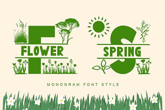
The Medic font by Viktor Hammarberg is a sans serif typeface with a modern and clean structure. The letterforms are minimalistic, impactful, and purposefully neutral to allow for versatile use across a wide range of contemporary applications in branding and advertising. As a free font, The Medic is a generous folksy contribution to the design community.
Being easy to read, the font is suitable for branding and visual identities, packaging design, magazine headers, flyers, brochures, and more. Its skeletal construction is easy to recognize and identifiable from afar, which makes it great for logo design where memorability is key.
The font comes with a free license suitable for personal or commercial use without any restrictions. Many would find such agreements convenient and gain of time even if it means paying a higher price tag to acquire it.
Author's note
Making a Clean and Usable Font
The goal is to create a font that is both visually appealing and practical for everyday use. This involves carefully selecting the appropriate typeface, font size, and other design elements to ensure readability and consistency across various applications.
When choosing a typeface, it's important to consider factors such as the x-height, stroke width, and overall character shape. A font with a larger x-height and slightly heavier strokes can often be more legible, especially at smaller sizes. Additionally, selecting a typeface with clear distinguishing features between similar characters (e.g., "l" and "1", "O" and "0") can help minimize confusion.
Font size is another crucial aspect. The ideal size will depend on the intended use, but generally, a range of 12-16 points is considered suitable for body text. Headings and titles may benefit from slightly larger sizes, such as 16-22 points, to create a visual hierarchy and improve scannability.
Kerning, the spacing between individual characters, also plays a role in the overall appearance and readability of the font. Proper kerning ensures that the text flows smoothly and that the spacing between letters is visually balanced.
Finally, consider the font's versatility and compatibility across different platforms and software. A font that works well in both digital and print environments will have greater utility and broader applications.
By addressing these key elements, you can create a clean and usable font that not only looks great but also enhances the reading experience for your audience.