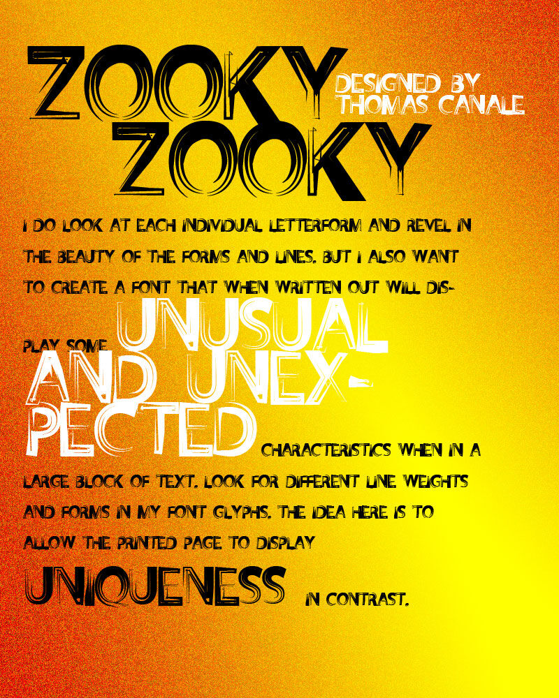
Description
Zooky Zooky font by Canale Studio, Inc., is an experimental and artistic free distorted font with a modern twist. This typeface balances intricate details with a geometric and futuristic style, making for an eye-catching and dynamic read. Its high-energy aesthetic makes it stand out in any design while adding a contemporary touch.
Use Zooky Zooky for a number of personal applications such as branding, banners, or advertising. Flashy headlines, magazine covers, or editorial paragraphs are another couple of great ways to put this creative typeface to good use. Take advantage of its creative design to get more engagement with your audience.
The free font is available free of charge but with a license for personal use only. Purchase a commercial license if looking to implement the font into your business practices.
Author's note
Setting type has been an occupation and a passion of mine over the last 30 years. After completing some schooling at Cooper School of Art in Downtown Cleveland, I accepted a position at Peto's Type House. Back then, the Cleveland Press still set type with 'Hot' lead. I know, this dates me, but the facts are the facts. PhotoType was in its infancy, with the Linotronic 5700 being top-of-the-line technology in photo type setting. My job at Peto's was more modest; among other things, I was hired to set headline type on what was called a 'Typositor.' It was still photo type setting but for headlines only. Letters had to be set (exposed), one letter at a time. A single headline of, let's say, 15 words or so could take an hour or two to completely finish for paste-up, that's right, I said paste-up. That should really date me!
By doing this day in and day out (for hours on end), I gained a "close-up" appreciation for letterforms and spacing. Ernie Peto would also quiz me on identifying type by name. It was an interesting 18 months, to say the least. There have been lasting effects on my appreciation of letterforms thanks to this experience.
Over the years, there have been spin-offs of wood type, Times Roman, Helvetica, and so on. It seems to me that we are just going over the same ground over and over again. What interests me is not the 'sameness' in the letterforms or their 'invisibility' in the graphics world. Some fonts are used to be 'invisible.' By this, I mean that they are merely a communication tool to deliver the authors' or writers' message. The artistry in the forms lies in their ability to stay invisible and be easy to read.
But their 'uniqueness' and how that difference translates to the printed page is what fascinates me. There are many ways of looking at letterforms. We can look at the beauty of the individual letters themselves, commenting on the curves of an uppercase 'A' or a lowercase letterform. Or we can look at them as a 'unit' and how that translates within a block of written text. It is this uniqueness that I am looking for in the fonts I design.
I do look at each individual letterform and revel in the beauty of the forms and lines. But I also want to create a font that, when written out, will display some unusual and unexpected characteristics within a large block of text. Look for different line weights and forms in my font glyphs. The idea here is to allow the printed page to display uniqueness in contrast.
