Font
Quaaykop
Author
Fonts
6
License
Added
Aug 9, 2023
Updated
Nov 28, 2024
Description
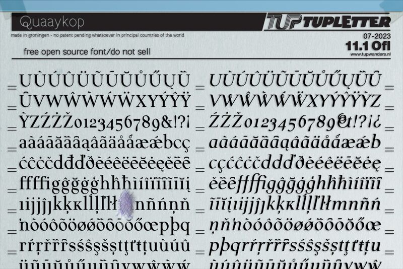
Quaaykop font family by Tup Wanders is a classic typeface designed to accentuate your professional projects with grace and style. This is a free font that includes 6 styles that can all be a delicate addition to your typography, each letter being fully proportional. With its high readability levels, it’s now finally possible to present your ideas in the best way possible along with an included sense of elegance.
Quaaykop presents classic features, on which the designer depended to bring you a professional body of text, paired with traditional projects like novels, magazines, or news pages. However, its balanced designs can also transform titles and logos both in print and online.
This font is available for public usage within the open font license agreement, so you won’t need to worry about legal issues for your personal and commercial projects.
Author's note
I use a couple of homemade, simple basic fonts as a foundation for my other designs. Recently, I realized I needed a straightforward serif font, but I never had the motivation to create one because, honestly, it seemed dull. However, a week and a half ago, during a heatwave that kept me indoors, I finally decided to work on that plain font from memory. I tried to recall the lessons I learned during my typography courses in art school, nearly forty years ago. While I aimed to keep it as simple as possible, I must admit I occasionally strayed into more creative territory—something you’ll notice when you see the font!
Introducing Quaaykop, available in Regular, Medium, Bold, and Italic styles. This marks my third font release this month. It may not be perfect, but I believe it will serve its purpose well, so I’m excited to share it with you.
font download: www.example.com/quaykop
Introducing Quaaykop, available in Regular, Medium, Bold, and Italic styles. This marks my third font release this month. It may not be perfect, but I believe it will serve its purpose well, so I’m excited to share it with you.
font download: www.example.com/quaykop
