Description
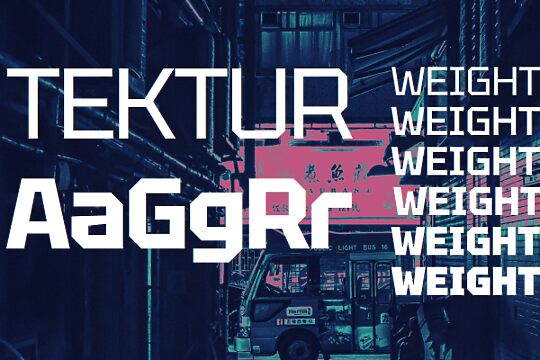
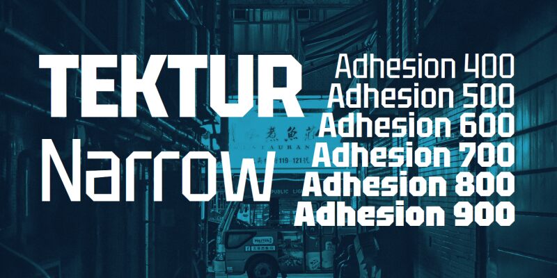
Tektur Narrow font family created by Adam Jagosz consists of 6 fancy font styles. Thanks to the open licensed terms, all aspects of this font give it a futuristic feel suitable for contemporary applications in digital media and technology branding.
Commercial brands will be satisfied with the professional feeling of Tektur Narrow. It is a structured uniform type, similar to the infamous Helvetica. Some font attributes such as cleanness, modernity, and geometric shape will be suitable if you’re looking for these particular hardware and software font characteristics.
This font can be freely used under several licenses including the public domain, GNU, and OFL.
Author's note
Tektur is a constructed typeface featuring octagonal outlines and rectangular counters. This rudimentary principle is applied where rounds are typically found, but most of the diagonals are left intact which helps preserve good readability and a familiar stance. The x-height is set high, and ascenders are aligned with the cap height, allowing for compact typesetting.
The Tektur static font family comprises three widths (Tight, Narrow, Normal) in 6 weights (Regular, Medium, SemiBold, Bold, ExtraBold, Black).
The variable version has the following axes:
* Width, ranging from 75 to 100
* Weight, ranging from 400 to 900
The typeface is free for personal and commercial use and is licensed under the SIL Open Font License, Version 1.1.
Get the variable version of the font or see the source files at https://github.com/hyvyys/Tektur
