Description
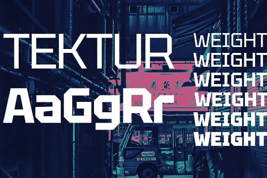
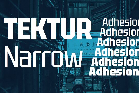
Tektur Tight font family by Adam Jagosz contains 6 free font styles. Its letters are readable, geometric, and structured with slightly angular caps. Their simplicity make them suitable for impactful headlines and short text blocks. While it lacks softness, there is a touch of elegance to it. Overall, its structure and boldness are its outstanding features.
Use Tektur Tight for magazine headlines, titles, branding projects, posters, packaging, website headers, and more. Use it to create minimalist movie posters, brand products with a modern touch, or advertise a tech product of any kind.
It’s important to note the public domain license of this font allowing you to freely use it in all your personal and commercial projects.
Author's note
Tektur is a constructed typeface featuring octagonal outlines and rectangular counters. This rudimentary principle is applied where rounds are typically found, but most of the diagonals are left intact, which helps preserve good readability and a familiar stance. The x-height is set high, and ascenders are aligned with the cap height, allowing for compact typesetting.
The Tektur static font family comprises three widths (Tight, Narrow, Normal) in 6 weights (Regular, Medium, SemiBold, Bold, ExtraBold, Black).
The variable version has the following axes:
* Width, ranging from 75 to 100
* Weight, ranging from 400 to 900
The typeface is free for personal and commercial use and is licensed under the SIL Open Font License, Version 1.1.
Get the variable version of the font or see the source files at https://github.com/hyvyys/Tektur
